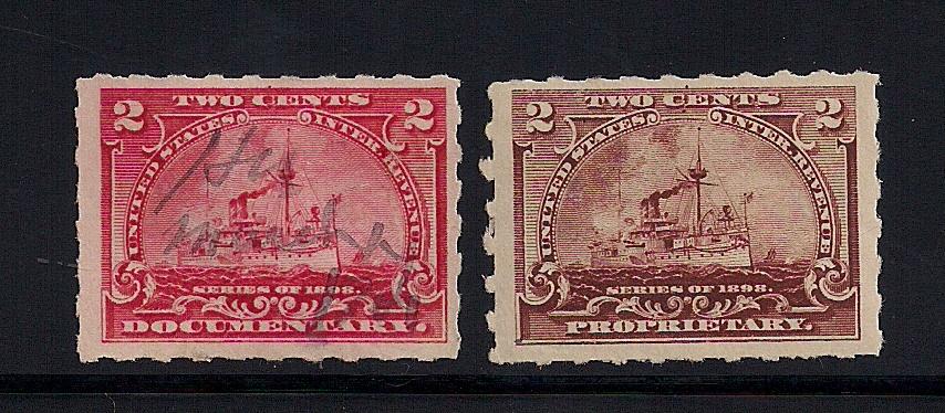
Showing posts with label Plate Varieties. Show all posts

Friday, May 28, 2021

1/8 Cent Proprietary with 50 Cent Beer Stamp Impressions

While there was an 1898 series of beer stamps, the stamps and the taxes they paid were not for the purpose of supporting the war effort, as they accounted to more general revenues for the US Treasury.  However, the Bureau of Engraving and printing was producing both the ongoing series of beer stamps while printing the battleship and other associated war stamps.  In their hurry to produce the new stamps and the ongoing series, they occasionally made a mistake.  This post presents an interesting example of one of those errors.

Frank Sente has supplied a block of the 1/8 cent proprietary that has non-inked vignettes of the REA60 beer stamp visible in the margin.  As a reminder, REA60 looks like this, with an image of Thomas Hart Benson in the center:


Below is a bottom right margin imprint and plate number 9437 block of twenty of RB20 wherein you can faintly see two vignette impressions of the REA60 federal beer stamp in the margin.


A cropped image from the block showing the BEP margin imprint and the lower of the two REA vignette image:


Frank ran the cropped image through a program called RetroReveal to "strenghten" the image of the REA60 vignette.    The vignette is inverted.  At the top you can read ..."rter Barr".. of Quarter Barrel above the recognizable image of Thomas Hart Benson's head with "Fifty Cents" below that. 


Thanks to Frank for sharing this.  If there is this one, there must be others.  Examine your battleships closely!

Saturday, December 29, 2012

David Thompson's 2 Cent Documentary Block of 6 with Double Transfer

There are not too many fly-speckers out there in philately anymore, especially for the battleship revenues, for which fly specks, e.g. double transfers, plate scratches, layout lines among others, are quite common.  But David Thompson keeps his magnifying glass handy and his scanner to more closely examine his battleships.  We don't report every new finding on this site, but occasionally there is an interesting item.  Today we present an R164 block of six with two fly-speckable stamps, one with a plate scratch and the other with a double transfer.  See the upper right and middle right stamps in the block below.


 Below:  Upper right stamp with double transfer.  David has marked the clear DT points with white arrows:


 Upper right stamp with double transfer showing across "TWO CENTS":


 Middle right stamp with plate scratch noticeable in the right margin.


Tuesday, September 13, 2011

5 Cent Proprietary "Plate Crack"?


Current Ebay listing for RB31p with an alleged "plate crack"


Currently, a dealer on Ebay is selling the above copy of a 5c proprietary battleship with a printed cancel for a $75.50 Buy It Now price due to a supposed plate crack running across the top portion the stamp.  While it may not be perfectly visible on this site, there is a clear, straight line running through the center of the left 5 on the stamp.  This line the dealer has labeled a plate crack.

While I am not an expert in printing techniques of the time, I am fairly certain that this is not a plate crack.  The line was placed on the plate on purpose by siderographers laying out the plate.  The line was used by these technicians placing the impressions of the stamp from the transfer roll on the plate in order to lay out the subjects in neat, straight and squared rows. 

These layout lines should not exist.  Normally they would be burnished off after the plate was produced.  In some cases, and this is one, they were not.  This particular line is solid and quite strong, which makes it stand out from the stamp.  While this may seem like a special item, there are literally tons of battleship stamps out there with evidence of these types of layout lines.

Don't be fooled, and certainly don't pay $75.50!

Wednesday, March 23, 2011

Position Dot (?) on the Half Cent Stamp in Yesterday's Post

Rereading yesterday's post I focused a bit on the stamp.  I've recently received a deluge of examples of so-called postion dots on the battleships, and I've become accustomed to looking for these near the top center of the stamp.  Yesterday's stamp presents an example of a dot in the center of the L in HALF at the top of the stamp. 


These so-called dots are everywhere once I start looking for them.  Is it the case on postage stamps that these dots were always so carelessly placed or not burnished off the plate?  What gives?  I understand that the Bureau was busy.  Is this the only explanation?

In the coming week I will post a few more examples of these kinds of dots.  Stay tuned.

Saturday, March 12, 2011

2 Cent Documentary Plate Varieties: Scratch

Most lines and dots on the battleship stamps are attributed to the intentional activities of the siderographers in laying out the subjects on the plate.  Here however, is a very obvious example of an unburnished scratch on the plate.  There is a curved red line in the margin above the stamp, independent of the design in the example below.


It is clear to me from this example as well as the broad variety of unburnished dots and lines that these plates were not viewed as tier one items in the BEP's quality control process. 

scratch is located inside the black circle

Friday, March 11, 2011

2 Cent Documentary Plate Varieties: Guide Dots with Lines

Here we have two examples of dots at top center external to the design accompanied by a clear line running horizontally across the plate.  The bottom stamp has a dot on the left side of the stamp at top as well.


2 Cent Documentary Plate Varieties: More Guide Dot Examples

There have been multiple examples of the so-called guide dots at the top centers of the battleship stamps in recent posts.  In this post are examples of two stamps with dots at the bottom of the stamp.  In the first example their is a dot in spandle toward the top of the stamp, but there is also a dot at the bottom just inside the frame line at center.


The example below includes a dot at bottom center outside the design of the stamp.


No matter what I read, I can't figure how the positioning of these dots made for accurate centering of the transfer roll on the plate.

Wednesday, March 9, 2011

2 Cent Documentary Plate Varieties: Guide Dot Examples

There are many examples out there of a dot in the middle of the spandle on the battleship stamps.  Here are two examples of a double dot in the spandle:


Tuesday, March 8, 2011

Monday, March 7, 2011

2 Cent Documentary Plate Varieties: Guide Dot Examples

This site has started a new theme in the past few days on the so-called layout dots and lines on the battleship stamps.  Philately has understood these to be the artifacts of the plate layout process.  Some readers here are not entirely convinced they all make sense as layout marks.  For the next week or so I will be posting examples of these dots and lines.  I have a fairly substantial set of examples on the 2ct doc, and will show one type and a variation today:

Dot just above upper frame line in center of stamp


Dot just above upper frame line in center of stamp, accompanied by a dot or other mark in the lower portion of the C of cents, not present on the stamp above

Based on centering and the cancels of the above two stamps, I believe these are stamps from the same sheet.  I am not sure how either dot, the one touching the frame line or the one in the C of cents, function as guide dots.  The one in the C clearly defaces part of the design, and would be difficult to burnish of the plate.  The dot touching the frame line does not help to center the stamp horizontally, though perhaps if accompanied by another dot on a different axis could help locate the subject on the plate.  Either way, why would only one stamp have the dot in the C?

Saturday, March 5, 2011

Guide Dots: Questions and Observations

Dave Thompson sends in the following questions and comments about the guide dot post from two days ago (I've done a bit of editing):

I know position dots are used to position the plate so that the transfer roll can be applied to the soft flat plate.  If your examples are position dots, what position is indicated by the dot in about the middle of the stamp towards to top? How can a person determine the proper place to apply the transfer roll (rounded) to orientation exactly in the middle so the position dot would always show in your examples?


Another point, if the description is correct, that could explain why there are examples of the plate screw showing sometimes on blocks, is the speed to needed in printing these stamps. Was it a fact they were in a rush to get these stamps printed? Could be, we all know the history of that time and the need was great that 1 and 2 cent provisionals were made, in addition to a $5.00 provisional.

I'm thinking your examples of position dots are not proper position dots, just a guess on my part, but I'm thinking when the position dots were being applied, they screwed up, and repositioned all the position dots, and just left the position dots (first ones applied in the incorrect position) where they were, did not bother to erase them out as there was to many of them, and they were in a hurry!


In other revenue stamps, especially the first issue revenue, the position dots are usually in the upper right corner, you can all see this on many of the 19th century regular stamps (before the Bureau won the contract in 1894).
****
 
I know very little about printing techniques on these stamps.  From a laymans point of view I would place light dots in two opposite corners of each stamp that would be hidden by the frame line in order to properly place and orient each stamp.  Why was it not done this way?  For what purpose was the mark that damaged the C in so many 2ct documentary stamps?
 
We would be interested in comments and additions from anyone with expertise in the printing methods on these stamps.

Wednesday, March 2, 2011

Guide Dots on Battleship Revenues

I'm not much of a fly-specker, but I was reminded by John's February 25, 2011 post about about a layout dot in the "C" of the word Cent on a two cent R164p issue, that I have numerous examples of layout or guide dots on a variety of other battleship issues.

While I understand the basic steps involved in preparing a plate for intaglio printing, I'm not a serious student of the engraved printing process and all the technical steps required to prepare a plate for actual printing, so I will rely on the Williams Brothers' classic primer, Fundamentals of Philately, to explain the purpose and function of plate guide dots and guide lines.

In this context the term "guide line" refers to any linear marking on the plate used as a "guide" during the process of preparing the plate preliminary to actual printing, and not guide lines purposely printed on sheets for uses after printing has occurred such as perforating, or cutting sheets into panes, or folding a sheet into a smaller size.

Figure 1
NOTE: Click on Images to Enlarge Them

If you look closely you'll see a "guide" or "position" dot in the letter "I" in the word FIVE on each of the 25-cent R169p issues in Figure 1 above.

Let's listen to the Williams Brothers as they explain the process of preparing a plate to receive image entries from a tranfer roller:

Usually, for varying reasons, the working area of the plate is marked with several series of dots, dashes and even continuous lines. The process of applying the dots and lines is termed 'laying out the plate.' All these markings, which are made after careful measurements, are made with the object of guiding the siderographist where to make the entries. Normally the intention would be that none of the markings should appear on the printed stamp--they should either be hidden by a feature of the design or obliterated by it, or else later removed from the plate. However, many instances are known of stamps bearing such dots, termed 'guide dots' or 'position dots' and lines called 'guide lines' usually within the edge of a design--in color, for, of course, the dot or line on the plate is in the form of a slight recess.

Figure 2

In Figure 2 the "guide dot" appears on these R171p issues in the area of the middle of the spandle between the arched words "United States" and "Internal Revenue". It's best seen in the far right stamp.
Figure 3

In Figure 3 the "guide dot" on these rouletted R163 issues appears in the top selvage above the letter "C" in the word CENT just outside the edge of the design. The third stamp appears to have a double dot.

Figure 4

In Figure 4 the "guide dot" on these hyphen-hole or slot-perforated R163p issues appears just above the middle of the spandle on ALL FOUR stamps in the block.


Figure 5

In Figure 5 the "guide dot" on these 10-cent R168p issues again appears in the middle of the spandle between the arched words "United States" and "Internal Revenue" And on the right stamp there is a faint guide line running through the lower part of the left numeral "10".


Figure 6

In Figure 6 the R164p at left is similar to John's R164 in that there is a "guide dot" in the letter "C" in the word CENT and part of a "guide line" showing in the right numeral "2". However, in this one there is another "guide dot" in the top selvage above the letter "C" just outside the edge of the design. There also appear to be two "guide dots" on the two-cent RB27p at right. One is just outside the top edge of the design between the letters "C" and "E" in CENTS, and another one just below and between those letters.

Figure 7

A "guide dot" appears in all six of the stamps in this RB20 block. In the top row the dot appears in the top selvage above the right leg of the first "H" in the word EIGHTH just outside the top edge of the design. They are faint so I've circled the dot on the first stamp in the row. In the bottom row the "guide dot" appears within the right leg of the first "H" in EIGHTH; again the dot is circled on the first stamp in the bottom row.

Figure 8

On this block of four of R171p fifty-cent issues there are no dots or guide lines visible in the top two stamps, but "guide dots" prominently appear in the middle of the spandle on the bottom two stamps and there is a dramatic guide line running entirely through both stamps, best seen in all four "50" numerals.

There were three different plate layouts for the battleship revenues and presumably all three plates were similarly prepared with guide dots and guide lines. But it's been more than a decade since I've looked at these stamps or thought about them. And as I'm not a serious student of the technical aspects of plate production, as I view them now several questions come to mind:


  • How many dots and lines were required to adequately layout a plate? Was a marking required for every entry?
  • Were some dots and lines actually erased and others left alone? And as the Williams' suggest were some lines and dots obsured or otherwise hidden within the engraved design?
  • Can examples of guide dots and guide lines be found on ALL values of the battleship revenues?
  • Was the rush to print these stamps so great that the BEP took short cuts or relaxed their quality standards ?
I'm mainly interested in on-document usages of the battleship revenues and have spent little time over the years studying the stamps themselves. But for anyone interested in plate flaws, double transfers, and plate re-entries etc., the battleships offer fertile ground for study.

We'd appreciate seeing examples of guide dots on other values of the proprietary and documentary issues and hearing from anyone who can elaborate upon the technical aspects of the plate layout requirements for the battleship stamps, especially with regard to the use of "guide dots" and "guide lines."

Thursday, February 24, 2011

2ct Documentary: Cancel and Plate Markings

D. APPLETON & CO.
OCT
3
1900
D. Appleton & Company was a publishing company located in the United States.  The company published many famous and best-selling books, including:
  • The Red Badge of Courage
  • Uncle Remus
  • Memoirs of William Tecumseh Sherman
  • The Works of Rudyard Kipling
The company no longer exists, having been merged with The Century Company in 1933 which was in turn merged with F. S. Crofts.  That company was purchased by Meredith in 1960, which was then purchased by Prentice Hall in 1960...and so on.

Meanwhile, this stamp has a couple of other interesting characteristics independent of its cancel.

The C in Cents has a layout dot or marking in the lower portion of the C.  This plate anomoly was documented in this post from January 5, 2011.

The right 2 shows a thin line running through the top portion of the numeral.  This is likely to be some sort of layout marking.  I have seen many of these lines and they usually run across the stamp and both 2s, this stamp only appears to have the line running through the right 2.

Wednesday, January 5, 2011

R164 Layout Dot on the "C" of CENTS

Will we ever escape Lake Shore & Michigan Southern Railway cancelled stamps?  Here are three more, cancelled over a 10 month period from April 1900 to February 1901, but with an interesting plate anomaly.  The black arrows are placed to call your attention to the lower right section of the "C" in CENTS.  In each case there is a prominent mark or layout dot  in the letter.  The three stamps have very different shades, and were likely purchased for use by the LS&MS over the 10 month period in which the stamps were used, demonstrating persistence in the use of this plate and this plate variety.


The January 2, 2011 posted copy of R164 also has this same layout mark
******

Last year at this time I was writing to you from Diani, on the south coast of Kenya.  Now I am writing to you from Kilifi, on Kenya's north coast.  This is a great place to spend the new year: hot, sunny and lots of quiet beach.  No snow! 


The view from the back porch this morning.

Saturday, November 6, 2010

Upper Left Plate Scratch on an R164

I'm not a fly-specker and I don't look at my stamps in a way that I regularly identify plate varietes, but the stamp below is a bit different for me.  There is scratch running from the upper left margin through the upper left corner of the stamp and into the base of 2 that is so large that my naked eyes reconized the flaw.  I know that on the battleship stamps there are numerous plate varieties, though none are catalogued. 


Close up of the scratch.

I would be interested to see other examples of this scratch if anybody has one.  Please send scans to 1898revenues@gmail.com